HeyTeam
A 60-hour designathon concept for remote teams who can't tell when it's okay to switch off.
The problem
When you work remotely, nobody can see when you're focused, free or done for the day. So people stay online longer just to look committed, and managers interrupt because they can't tell who's busy.
The numbers back that up. In 2022, Microsoft found that 87% of employees said they were productive, but only 12% of leaders fully believed their teams were. Buffer's surveys had "not being able to unplug" as the top remote work struggle two years running.
Our own questionnaire (35 responses) pointed the same way. Switching off felt like a personal choice instead of something a team did together, and that's what we set out to change.
What we made
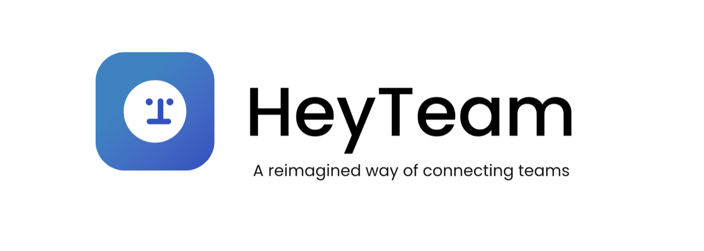
HeyTeam puts your team in a shared virtual office. Everyone shows up as a character, so you can see who's around.
Unplug Together
You get notified when the workday ends so the team doesn't work overtime. Everyone turns off the office light together, and anything sent after hours lands in a drop-box. It supports the need to disconnect and reinforces team norms around availability.
Work as a Team
This one builds stronger relationships, so people can be more vulnerable with each other and trust each other. It encourages lightweight social signals that strengthen trust and collaboration.
Be Free from Distractions
Daily tasks are clearly assigned, so the team knows what each person is working on and nobody gets overloaded. It clarifies workload, reduces cognitive load and improves focus.
Decisions I made
Make switching off a team thing
Reminders put all the pressure on one person, and I believe systems change behaviour better than reminders do. With Unplug Together, the whole team clocks off, so leaving stops feeling personal. The catch is that it only works if the team buys in.
Show people exactly where they stand
Focused, available or offline. People wanted to know the app had registered what they'd picked, so each state had to be obvious, with instant feedback. We tested our Figma prototype with five people, found the moments that were still unclear, and I tightened those up.
Pick calm over more features
Productivity apps can feel like they're judging you. We went with a softer look and held back on features to keep it that way. Testers called it "welcoming" and "non-judgemental", which was exactly what we were going for.
What I took away
There were four of us. I mostly framed the problem, narrowed the scope, turned our research into design principles, and shaped the structure and story of our pitch. When discussions drifted, I pulled us back to the one problem we'd picked.
We came second and won the Design Process & Creativity Award, which told me we'd picked the right problem. Under time pressure, clarity beats completeness.
We only had time for one round of testing and never got in front of managers. With more time, that's where I'd go next, and I'd measure whether people actually get interrupted less.