
HeyTeam is a behaviour-led productivity concept designed during the SUEDE x Atlassian Student Designation.
In 60 hours, I helped my team identify a core remote-work problem - invisible boundaries - and designed a system that encourages healthier team coordination and switching off.
Outcome: 2nd Place - Design Process & Creativity Award

HeyTeam - Designing for Behavioural Change in Remote Teams
CONTEXT: SUEDE X ATLASSIAN DESIGNATHON (60 HOURS)
MY Role: product UX/designer
MY Team: group of four
TOOLS USED: miro, FIGMA, CANVA
OUTCOME: 2nd place - winner of the “Design Process and Creativity Award”
The Problem 🧐
Remote work doesn’t fail because people aren’t productive - it fails because availability, focus, and boundaries are invisible.
Through early research, clear patterns emerged:
Employees stayed online longer to signal commitment, not because work required it
Managers interrupted deep work due to lack of visibility
Switching off felt like a personal choice instead of a shared norm
This resulted in burnout, anxiety, and weakened trust across teams.
Problem statement - How might we help remote teams coordinate availability and disconnect in a way that feels shared, visible, and non-judgemental?
My Role 💼
I worked closely with my teammates throughout the designathon, while taking primary responsibility for:
Framing the core problem and narrowing scope under tight time constraints
Translating research insights into clear, actionable design principles
Leading the structure and narrative of the final pitch deck
I also played a key role in grounding the team when discussions drifted, ensuring we stayed focused on solving one meaningful behavioural problem rather than diluting impact across multiple surface-level features.
How we worked 🤜🤛
Since we only had 60 hours, our design process prioritised speed, alignment, and decision-making over comprehensive exploration.
Rather than following a rigid framework, we worked in short, focused cycles:
Rapid research to identify behavioural patterns
Early synthesis to align on one core problem
Fast concept evaluation
Iteration driven by clarity, not completeness
This approach allowed us to stay grounded under time pressure, make confident trade-offs, and focus on behavioural impact rather than feature volume.
Research & Key Insight 🔬
We conducted a rapid questionnaire (35 responses) and desk research to understand how people interpret productivity and availability signals in remote teams.
Key insight - Coordination breaks down not because people don’t work - but because teams lack shared context around availability and boundaries.
This insight directly informed what we prioritised, and just as importantly, what we chose not to build.
User Needs (distilled from research) 👂
From our research insights, we accumulated a focused set of user needs that captured the underlying behaviours and tensions we observed. These needs helped us stay grounded in why we were designing, and acted as a filter for prioritisation under time pressure.
I want to build stronger relationships with my team so that trust and vulnerability can develop naturally, even when working remotely.
I want equal visibility whether I’m working remotely, in-person, or hybrid so I don’t feel anxious about how my productivity is perceived.
I want fewer interruptions and better focus when working remotely so I can concentrate and complete my tasks efficiently.
I want clearer signals around what my teammates are working on so work feels coordinated and I’m not overloaded with requests.
I want a clear, shared signal for when the workday has ended so I can disconnect without guilt and avoid working overtime.
These needs directly informed the concept and the design decisions outlined below.
What we built (at a glance) 🚀
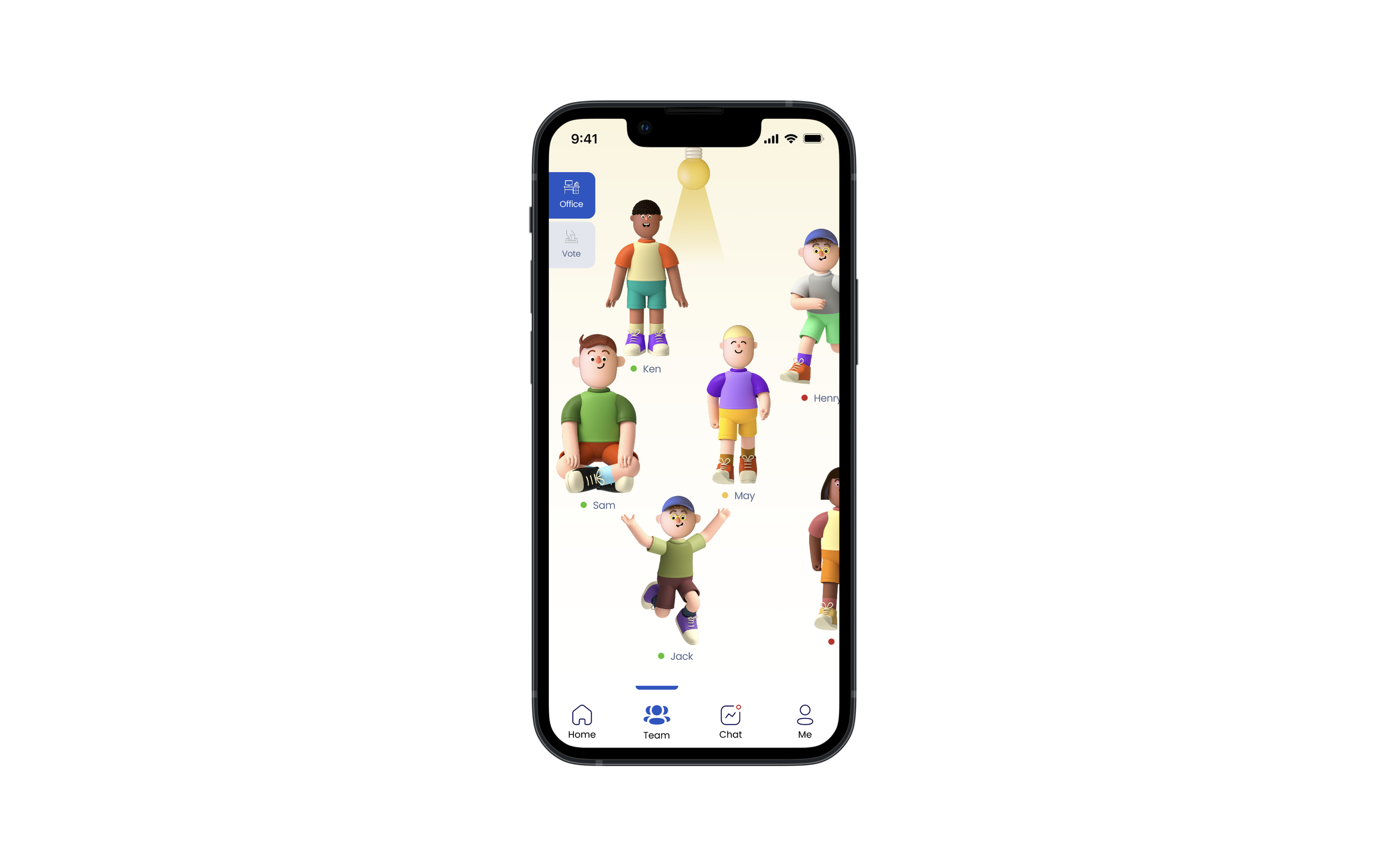
HeyTeam is a lightweight system that helps teams coordinate availability and disconnect through shared visibility, not additional communication. This overview highlights the three core features that directly address key user needs and informed our design decisions.
1. Unplug Together
Be notified when the work day ends so the team doesn’t work overtime.
This feature helps support the need to disconnect and reinforces team norms around availability.
2. Work as a Team
Build stronger relationships within the team so they can be more vulnerable with / trust each other.
This feature helps encourage lightweight social signals that strengthen trust and collaboration.
3. Be Free from Distractions
Have a clearer assignment of daily tasks so the team knows what each person is working on and won’t be overloaded.
This feature helps clarify workload, reduces cognitive load, and improves focus.
This overview provides context for the three design decisions outlined below.
Three design decisions I’m proud of:
1. Designing for shared behaviour, not individual discipline - Instead of reminding individuals to set boundaries, we designed Unplug Together - a collective clock-off experience that normalises switching off as a team behaviour.
Reduced guilt around disconnecting
Shifted responsibility from individuals to the system
Reinforced healthier norms without managerial enforcement
2. Making work states explicit to reduce anxiety - Ambiguity around availability caused hesitation and over-communication. we prioritised clear, visible system states (focused, available, offline) with immediate feedback.
Increased user confidence when switching states
Reduced follow-up messages like “are you still online?”
Strengthened trust through visibility
3. Choosing emotional tone over feature density - Rather than adding more productivity features, we deliberately pushed for a calm visual language.
Participants described the product as “welcoming” and “non-judgemental”
Supported adoption by reducing anxiety around visibility
Testing and Iteration 🎨
One round of user testing was conducted using the “think aloud protocol method” with five participants, who were given three set tasks to perform with our interactive Figma prototype. This helped validate the emotional tone of the product, but also revealed moments of ambiguity around state confirmation.
Based on feedback, I:
Strengthened visual feedback for state changes
Simplified onboarding explanations
Reduced uncertainty in system responses
This reinforced the importance of testing for emotional clarity, not just usability.
Project Reflection 📚
This project reinforced my approach to design: being judgement-driven, behaviour-led, and outcome-focused.
Winning the Design Process & Creativity Award validated that impact doesn’t come from feature quantity - it comes from choosing the right problem, committing to it, ensuring it meets user needs, and executing with clarity.
What I learnt
Behaviour change is more effective when reinforced by systems, not reminders
Under tight constraints, clarity beats completeness
Visual choices plays a critical role in trust and adoption
What I’d do differently
Considering the time constraints of the designathon, if I had more time, next steps would include:
More user testing to further refine our prototype
Measure success using behavioural metrics (interruptions, after-hours activity)
Internally test our design against the Ten Usability Heuristics
Internally test our design with WCAG accessibility guidelines
Testing with managers from Atlassian to get their perspective on our solution
Add onboarding features for new employees
Explore deeper integration with existing Atlassian tools
Create an Admin version of the app so that admins can create polls